Episode Summary: This is the shortened "highlights" version of episode 106. Was the housing market really oversupplied in the mid-2000s? Kevin Erdmann says no, and he explains how this misunderstanding is at the root of present-day affordability problems. This is part 8 of our series on misaligned incentives in housing policy.
Show notes:
- Erdmann, K. (2018). Housing Was Undersupplied during the Great Housing Bubble. Mercatus Center.
- Erdmann, K. (2024). Getting Corporate Money Out of Single-Family Homes Won’t Help the Housing Affordability Crisis. Mercatus Center.
- Erdmann Housing Tracker: Mortgages Outstanding by Credit Score
- Erdmann Housing Tracker: Follow-Up: Mortgages by Credit Score
- Erdmann, K. (2021). A Suggested Mortgage Amortization Structure: Fixed Amortization, Adjustable Principal. Mercatus Center.
Housing Was Undersupplied During the Great Housing Bubble
- “Just a few cities are at the heart of the housing supply problem, most notably New York City, Los Angeles, Boston, and San Francisco, which I refer to as Closed Access cities. There are two very different housing markets within the United States: the Closed Access market, where new housing is highly constrained, rents rise relentlessly, and households are forced to make difficult choices as housing expenses eat up their budgets; and the rest of the country, where homes can generally be built to meet demand, housing construction is healthy, and housing expenses remain at comfortable levels for the typical household.”
- “If we add these two markets up into an aggregate market, it looks like a market where rents are relatively level over time. In the 2000s, when housing starts were rising and home prices were also rising to unusually high levels, it appeared as if those rising prices were unrelated to rent, and it appeared that prices were rising at the same time that supply was rising. This pattern, rising prices and quantities, seemed to be the result of excess demand—too much credit and too much money funding too much housing.”
- “Yet few places fit that description. For the most part, there were places where housing starts were low, while rents and prices were both rising, and there were places where housing starts were healthy, while rent and price increases were moderate. If we compare median annual rent and median home price within each metropolitan area, it is clear that rents were an increasingly important determinant over the past two decades of home price differentials between different metropolitan areas. And as shown in figure 5, in this regard, the Closed Access cities have become outliers—much higher rents leading to much higher prices.”
- “The Closed Access cities have become new centers of prosperity, but they have limited the growth in their populations through restrictive zoning and bureaucratic obstacles that make it difficult to build housing. This has turned them into enclaves of privilege, only open to the richest newcomers, who spend nearly half their incomes on rent. This pattern has only developed since the 1990s and is neither normal nor natural.”
- “From 1996 to 2005, across the United States permits were issued to build 6.5 homes per 100 residents. The Los Angeles, Boston, and New York metro areas each approved fewer than 2.6 per 100 during that time. San Francisco approved 3.4. In contrast, other economically prosperous cities that attract aspirational families in search of economic opportunity, such as Washington, DC, Seattle, and Dallas, issued permits at rates higher than the national average.”
- “Contrary to Chairman Bernanke’s assumption, at the national level there was no overhang of housing supply that needed to be worked off in 2011. Indeed, even in 2005 there was no national oversupply of housing. Rather, the American economy was burdened by a shortage of housing, especially in the Closed Access cities.”
- “The housing bubble was concentrated in cities in the coastal Northeast, California, Nevada, Arizona, and Florida. Limiting our analysis to the 20 largest metropolitan areas, the Closed Access cities make up three-quarters of the “bubble” cities, in terms of total real estate valuation. Constrained housing supply was clearly the primary source of high prices in those cities, not excess demand. Prices in the Closed Access cities today remain as high relative to other cities as they were during the bubble because constrained supply is the fundamental reason for those high prices, not reckless credit markets.”
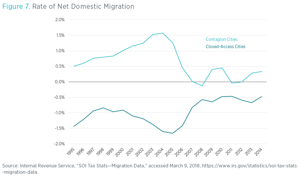
- “Even in other bubble cities with generous building policies, the primary cause of rising prices was the severe Closed Access shortage of housing. This is because those other bubble cities were the main destinations for households migrating out of the Closed Access cities. I call those cities Contagion cities, because in spite of their more generous building policies, they were overwhelmed by the problem created by the Closed Access cities. In the years leading up to the financial crisis, the shortage of housing in the Closed Access cities had become so severe that each year hundreds of thousands of households moved away in search of an affordable home. Many of them landed in inland California, Nevada, Arizona, and Florida.”
- “Figure 7 compares net domestic migration of Closed Access cities and Contagion cities. Notice that high rates of out-migration from Closed Access cities correspond to periods of large in-migration to the Contagion cities. Credit markets may have facilitated some of the housing activity during the housing bubble, but at its core this was a mass migration event caused by a lack of housing.”
- “For many people, it seemed obvious that there was overbuilding in places like Phoenix. From 2003 to 2005, Phoenix built many homes. Meanwhile, prices of Phoenix homes rose by about 75 percent in just two years. By 2007, however, the Phoenix housing market was collapsing, buried in a mountain of unclaimed inventory. Surely, it was argued, this was a classic credit-fueled boom and bust.”
- “But, for the boom-and-bust story to add up, Phoenix would have had to build enough homes for all of those new households moving in from California, and then it would also have had to build tens of thousands of units in addition to that. It couldn’t. The problem Phoenix encountered was that the in-migration was so strong that even Phoenix authorities couldn’t approve new supply fast enough to meet demand. Building permits in Phoenix jumped by about 50 percent from 2001 to 2004. By all appearances, that is an extremely frothy market, but as figure 8 shows, the jump in new homes tracked virtually 1:1 with net in-migration.”
- “Many of those in-migrants were coming from California. They were moving to Phoenix largely to reduce their housing expenses. In fact, even though migration from California had continued to rise up through 2005, net migration into Phoenix had leveled off. That is because increasing numbers of households now began moving away from Phoenix, which had seen soaring home prices. From 2005 to 2008, migration into Phoenix declined each year while migration out of Phoenix continued to rise. By 2008, net in-migration into Phoenix was less than 10,000 households. By 2006, Phoenix had a growing number of empty homes and a large inventory of homes for sale. But from 2005 to 2008, the number of new homes approved in Phoenix dropped faster than net migration was dropping. Housing supply had reacted remarkably quickly to shifting demand. Even as housing starts were collapsing, rents were rising, as they were in most cities at the time.”
- “The question that needs to be addressed about the housing bubble and the ensuing bust is not what caused prices to rise so sharply. That is a fairly straightforward question, with a standard economic answer. Fundamentally, there weren’t enough houses. What caused the massive out-migration from the Closed Access cities? The answer to that question is also, fundamentally, that there weren’t enough houses.”
- “This leaves one additional question that has been rarely asked, and which must be answered if we are to come to terms with the crisis that followed. If a lack of housing was fundamentally the cause of the housing bubble, then why had housing starts been collapsing for more than a year before the series of events occurred that we associate with the crisis, like nationally collapsing home prices, defaults, financial panics, and recession? And what caused the Closed Access migration event to suddenly stop at the same time as the collapse of housing starts?”
- “For a decade, the collapse has been treated as if it was inevitable, and the important question seemed to be, What caused the bubble that led to the collapse? This needs to be flipped around. Given the urban housing shortage, it was rising prices that were inevitable. So the important question is, Why did prices and housing starts collapse even though the supply shortage remains? And why were housing starts still at depression levels in 2011?”
- “The surprising answer to those questions may be that a housing bubble didn’t lead to an inevitable recession. It may be that a moral panic developed about building and lending. The policies the public demanded as a result of that moral panic led to a recession that was largely self-inflicted and unnecessary. They also led to an unnecessary housing depression that continues to this day.”
Getting Corporate Money Out of Single-Family Homes Won’t Help the Housing Affordability Crisis
- “Figure 1 shows the quarterly amount of mortgage originations (new mortgages) as a percentage of the total value of owner-occupied housing. (When interest rates decline, many households refinance their mortgages. That explains the bumps in 2003, 2012, and 2019. Note that the 2003 bump predated the subprime private securitization boom, which dominated new mortgage activity from 2004 to early 2007.) Except during the refinance booms, borrowers with credit scores higher than 760 regularly borrowed capital equal to about 1 percent of owner-occupied US housing stock each quarter, both before and after the Great Recession.”
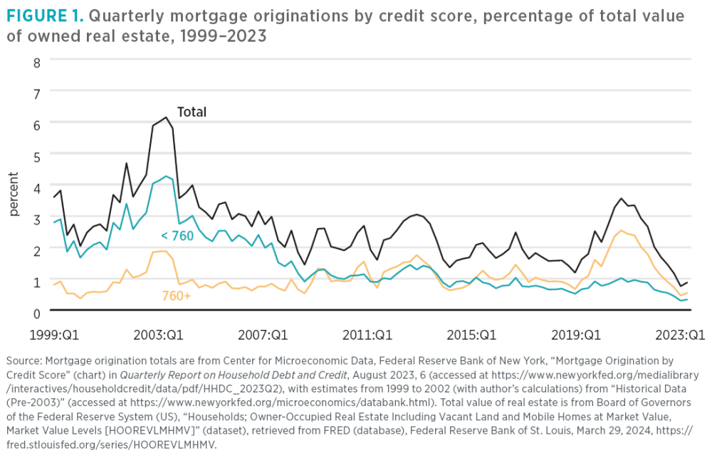
- “Before the Great Recession, borrowers with credit scores below 760 regularly borrowed capital equal to between 2 and 3 percent of the value of owner-occupied US housing stock. That percentage range, as well as the proportion of mortgages originated to borrowers with lower credit scores, didn’t rise appreciably during the subprime boom period from 2004 to 2007. Then, between 2007 and 2009, the proportion of new mortgages going to borrowers with scores below 760 dropped by more than half and remains that low today. (The average credit score among all borrowers tends to be a bit above 700 points.)”
- “This change wasn’t a reversal of the boom era subprime lending excesses. The same pattern showed up at Fannie Mae (Federal National Mortgage Association). As figure 2 shows, from 2000 through 2007, the average credit score on Fannie Mae mortgages barely changed. Figure 2 also compares Fannie Mae’s estimate of the value of homes being funded by new mortgages and the value of homes in Fannie Mae’s book of business (homes with mortgages that had been originated in earlier years). Home prices had risen, but the homes associated with old mortgages had similar values to the homes associated with new mortgages. In other words, even though home prices were rising, the mortgages were going to the same types of borrowers in the same types of homes in 2007 that they had been going to for years.”

- “By 2009, the value of homes across the country, including those with Fannie Mae mortgages, had fallen significantly. But in 2009, the average credit score on new Fannie Mae mortgages was about 40 points higher than it had been previously. And, strikingly, the average value of those new homes skyrocketed to well over $300,000—about 60 percent higher than the homes with mortgages from earlier years.”
- “The profile of borrowers served by conventional lenders changed greatly after 2008. Those with credit scores under 760 were much less likely to qualify for mortgages, so the homes those borrowers were likely to live in had fewer potential buyers.”
Mortgages Outstanding by Credit Score
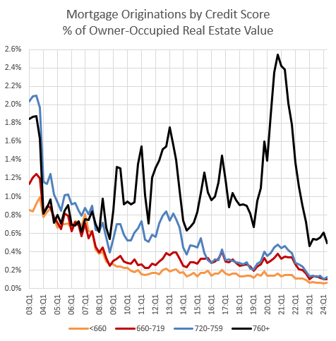
- “At Fannie Mae, before 2008, roughly 2/3 of mortgage lending went to sub-740 credit scores. Then, it suddenly switched, and since 2008, roughly 1/3 of mortgage lending went to sub-740 credit scores. The proportion of lending going to lower credit scores had been pretty stable as far back as I can track the data. The sub-prime/Alt-A lending boom wasn’t associated with a significant change in lending by credit score.”
- “You can see that in Figure 1, from the New York Fed’s Household Debt and Credit report. There was a refi boom in 2003, which tends to increase mortgage activity among the highest credit scores. Then, from 2004 to 2007, during the subprime/Alt A boom, proportions returned back to the long-term norm. The New York Fed tracks 5 bins of credit scores. I have combined the bottom 2. Total activity before 2008 tended to be roughly the same in the 4 bins, and other data finds those proportions at least into the 1990s. Compare that to today, where all mortgage originations to scores under 740 don’t even add up to the quantity of originations to scores over 760.”
- Figure 1.
- “Since 2008, we’ve had a haves and have-nots market. A third of borrowers are locked out of the market. And borrowers who can still get mortgages had a buyer’s market with, until recently, both moderate prices and low interest rates. It was, by far, the best time in recent history to be a mortgaged buyer, for those who were allowed to be.”
- “The have-nots who lost their homes or are unable to buy homes have gotten the worst of the crackdown, because their rents have generally increased massively. The have-nots who were grandfathered in and managed to hold on to their homes ended up with a bit of a windfall because their homes, especially, have elevated prices because of the effect the mortgage crackdown has had on rents.”
The Moral Panic, Its Perpetrators, and Its Victims
- “I have done something like this before – tracking a poor and a rich ZIP code through the timeline of our offenses. It’s time for an update. I hope that this can provide a concise and comprehensive picture of the confusion and devastation of the mortgage moral panic. Here, I will be comparing 2 ZIP codes in Atlanta. ZIP code 30022, where the average income is currently about $190,000, and ZIP code 30344, where the average income is currently about $50,000.”
- “Figure 1 shows the typical price/income ratio in the rich (red) and poor (black) ZIP codes, over time. The price/income ratio in the rich ZIP code approximates a straight line. The price/income ratio in the poor neighborhood approximates a straight line until 2008. The 3x – 4x levels of price/income in the period before 2008 are pretty common for amply housed cities with normal markets, for those of us old enough to remember one.”
- Figure 1.

- “Figure 2 shows the rate of new construction in Atlanta for single-family and multi-family.”
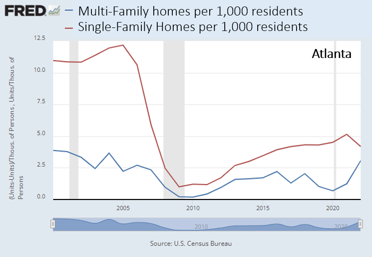
- “The decline in building was in low-priced new homes. Builders will claim that they can’t build for the low end of the market because their costs are too high. Costs may be high. Productivity in construction has been poor for a long time and there are creeping regulations. But everything looks like a cost problem to builders. In 2012, when the existing homes in ZIP code 30344 were selling for 1.5x incomes, the builders couldn’t profitably build new homes at that price.”
- “Also, at odds with that, apartments, which generally face more stringent local regulations and are generally smaller and more complicated to build, recovered faster and more completely than single-family construction. They recovered more quickly on price too. Figure 3 compares the Case-Shiller estimate for single-family home prices to the Costar estimate of multi-family home prices.”
- “Others believe there had been a bubble and so they still maintain that from 2008 to 2012, home prices in ZIP code 30344 followed a predictable and unsurprising path … There is a supply version and a price version of that assertion. Baker asserted the price version, which is ridiculous on its face when you look at Figure 1. But, the supply version is just as questionable. Where prices had been relatively stable, as in Atlanta, it was because the lending boom before 2008 had supposedly created a massive construction boom. But, construction in Atlanta was no higher in 2005 than it had been in 2000, and then it dropped precipitously in 2006 and 2007. By the time prices bottomed out in 2012, pick any time period length (2 years, 5 years, 10 years, 20 years) and housing construction for that period was the lowest for the period ending in 2012 than it had been in any other period since data have been collected.”
- “The incorrect explanations tend to all suffer from the same problem. They treat a ridiculously deep disequilibrium as a benchmark. On every margin, the housing market had to correct back from that disequilibrium. The prices of homes in ZIP code 30344 could not possibly remain at 1.5x incomes. And so, all the alternative explanations for what happened after 2012 basically observe things that will inevitably happen after a disastrous credit crackdown (more investors, fewer builders, rising rents, etc.) and construct spurious correlations from them.”
- “One more thing to note in Figure 1 is that price/income has recovered in ZIP code 30344 to a level well above the pre-2008 norm. New homes get built when the prices of existing homes are higher than the cost of constructing new ones. If the Atlanta market was producing new housing across both high and low tiers before 2008, then it should be producing new homes today. But, as Figure 2 shows, single family construction is still less than half the pre-2008 norm. This should be inducing new construction.”
Shane Phillips 00:00:00
Hello, party people. I wanted to try out something new, so I took our most recent episode and cut it down to a third its original length. I suspect most of our listeners appreciate our hourlong format and the depth that it allows, but I also know it can be a barrier. If you think this truncated format has some value, or if it could with some revisions, let us know. And if it's not your cup of tea, not to worry, because if we make these shorter episodes a regular feature then it'll be alongside the longer ones, not replacing them. They take a lot of time to put together though — As the saying goes, "I would have written a shorter letter, but did not have the time." — so I want to be sure it's an investment our listeners get something out of. Tell me what you think. Listen for my email and our Substack url up ahead.
Kevin Erdmann 00:00:57
...because we collapsed construction across the country through mortgage regulation, so that the supply conditions changed uniformly across the country, now every city looks a little bit more like Los Angeles. In 2005, we completed about 2 million homes, and by 2012 it was down to 600,000. For the past decade, we basically have been a country that needs 2 million homes a year that was only capable of completing 1 million.
Shane Phillips 00:01:29
Hello! This is the UCLA Housing Voice podcast, and I'm your host, Shane Phillips. This is episode 8 in our ongoing Incentives Series, supported by UCLA's Center for Incentive Design. Kevin Erdmann is joining us this time to do some mythbusting about the mid-2000s housing market leading up to the crash and the Global Financial Crisis, the policy response in terms of federal mortgage lending standards, and its catastrophic effect on homeownership, rental affordability, and housing production. As we discuss, tightening of lending standards leading up to and following the crash ended up shutting out roughly a third of the conventional mortgage borrowers, people with good credit scores and low borrower risk. Worse, we shut out these borrowers as a response to perceived overlending and oversupply of housing in the mid-2000s, a perception which Kevin shows quite persuasively to be false, pulling together data on housing prices, rents, mortgages, and other data from across the country. The result was a post-2008 crash that was much deeper and longer-lasting than it had to be, that decimated the construction industry even as it kept growing in peer countries like Canada and Australia, that dramatically shrank the market for new construction, that drove up rents, and that disproportionately hurt lower and middle-income households and communities. Throughout this series we've been talking about the costs of being overly cautious, and restricting mortgage credit to this degree deserves to go right to the top of the list. The Housing Voice Podcast is a production of the UCLA Lewis Center for Regional Policy Studies, with production support from Claudia Bustamante, Brett Berndt, and Tiffany Lieu. You can reach me at shanephillips@ucla.edu, or on Bluesky and LinkedIn. You can also comment on this and other episodes on our Substack, uclahousingvoice.substack.com. With that, lets get to our conversation with Kevin Erdmann.
Shane Phillips 00:03:45
Kevin Erdmann writes at a Substack called the Erdmann Housing Tracker, and he's the author of two books — Shut Out and Building From the Ground Up — and he's also a senior affiliated scholar at the Mercatus Center at George Mason University. Today he's joining us to talk about how we came out of the global financial crisis of 2007 to 2008 with much tighter mortgage lending standards and how those changes have influenced housing production, affordability, and home ownership in the years since. Kevin, thanks for joining us and welcome to the Housing Voice Podcast.
Shane Phillips 00:04:04
If Kevin is known for one thing, it is probably his argument that the thing we call the housing bubble of the mid-2000s was not really a bubble at all, but in fact, a housing shortage. It was a housing shortage, we failed to appreciate because it was limited to just a few metro areas across the country, but the impacts did not stay contained to those places, and they spread to other metros over time...
Kevin Erdmann 00:04:27
The motivating core of the story is that there were two very different types of cities during that housing boom. There were what I call the Closed Access cities, which is a very specifically New York City, Boston, San Francisco, Los Angeles, and San Diego. And San Jose, of course, along with San Francisco. And those cities are, basically across the board, just have such clamps on housing supply throughout the metropolitan area that they've effectively stopped growing. You know, we naturally tend to want to spend a given percentage of our incomes on housing. And so even with a flat population, if our real incomes go up, say 1%, people want to consume 1% more housing per capita, but the thing is, when growth is higher than that — and these cities are really only capable of growing their housing stock, by about 1% — then it actually creates this weird countercyclical population and migration trend where the better off we are, the more people have to move away from those cities to settles the housing market there. The Contagion cities — which are cities in Florida, Arizona, and Nevada — those were the destinations for those displaced families. So the shortage in the Closed Access cities is what creates the demand boom in the Contagion cities. When we're growing, the rest of the country actually has to sort of overproduce housing and overproduce economic growth to take in all these housing refugees from the Closed Access cities. So basically what happens in Arizona and Nevada and Florida is they had this surge of inmigration that they actually weren't able to keep up with. They were building houses for fundamental reasons that thousands of people were moving in.
Shane Phillips 00:06:05
I don't remember if I saw this in something I read of yours but is there another city? Is there like a Open Access city? How do you classify the places like Texas, and what was their experience? Because I think most people's understanding of the housing bubble, the housing crisis through the 2000s or the end of 2000s was that everywhere saw prices shooting up at roughly equal levels. And that's not true at all, right? There actually was not a huge run up in prices in some markets.
Kevin Erdmann 00:06:36
Yeah. In fact, most of the country. In Shut Out, I had three categories, Open Access, Closed Access, and Contagion. And Open Access was probably close to two-thirds of the country. Closed access is probably about 25%, and then about 15% would be in the Contagion areas. it's very easy to tell those markets apart because during the boom times the Open Access cities construction rates were basically flat. They were just building at the same rate. They didn't have a big boom and prices and rents were relatively stable.
Shane Phillips 00:07:11
So we had these Closed Access cities — like Los Angeles, San Francisco, New York, et cetera — that... demand was increasing. People were earning more money, but they were not building much more housing. And so we had this flow of people who just made the decision, or the decision was made for them in some cases, they just could not continue to afford the Closed Access. Someone had to leave given the rising demand, and the lack of supply to compensate. And a lot of those people went to places like Nevada and Arizona and Florida. And I think the key point for these Contagion metros is we see places like Las Vegas and Phoenix as having overbuilt during, the 2000s, and that was a problem we needed to solve. But what your research shows is, in fact, relative to the migration that was happening into those places, they were, for a while, just barely keeping up with demand. And for a very short time, they actually fell behind. And so even in these places we think of as building the most housing, being the most oversupplied, they were kind of holding steady at best. Whereas the highest demand places like Los Angeles were not keeping up at all. You don't see a boom in production at all during the 2000s in places like LA and New York. And so, you know, when you put all that together, you have some places barely keeping up, other places, not even trying to keep up. That is a housing shortage. It just looked a lot different than the one we've been more familiar with the past 10 years or so. So I think that because we have this idea of the housing crash being driven by lending too much for mortgages, and in particular lending to people who shouldn't have been getting mortgages — subprime lending. Some people might hear this explanation that you're offering and interpret it as dismissing concerns about lending to people who shouldn't have been borrowing, which did screw over a lot of people. But I think that's not your message, right? Subprime lending was a serious problem, and we were right to restrict it. It's just that too much lending in general does not stand up to scrutiny as the cause of the housing crash, and the recession, because we weren't actually overbuilding overall. Is that right?
Kevin Erdmann 00:09:23
So, yeah, there was definitely reckless lending that created a number of problems, and probably had a marginal effect of increasing the average home price by maybe 8% or so before 2008. So I would say that's all true, and then I would surround that with a number of caveats. The first caveat is that real home prices have increased by more than 50%. The other 42% has been broadly blamed on loose lending when it was really due to these fundamental causes.
Shane Phillips 00:09:49
So, summarizing here. Basically, we misdiagnosed housing supply booms in these Contagion metros as an oversupply driven by excessively lax mortgage borrowing standards, when in fact there were an entirely rational and, and really appropriately sized response to a huge wave of migration out of the Closed Access metros. And once we decided that loose lending was the cause, the obvious solution was to tighten those lending standards, which we did starting in 2008 or so to great effect. I pulled some stats from a few of your papers that help illustrate the effect of those stricter standards on borrowers — that I'm gonna share here really quickly. so these refer to credit scores, and a score in the mid-700s or above is considered very good to excellent. 670ish to 740ish is good. And below that, you're in fair to poor territory. And from 1999 to 2007, about two-thirds to three-quarters of the value of mortgage originations was for borrowers with credit scores under 760. This is the total value of new mortgages taken out in a given year. So most of that value was people with good, but not very good, not excellent credit. The rest of borrowers had scores of 760 or above. Since 2008, the ratio shifted from around 70/30 in favor of borrowers with lower credit scores to more like 50/50 or even 40/60 in favor of borrowers with higher scores. You could see a shift like that if borrowers with excellent credit just started taking out more mortgages, but that is not what happened. The shift was caused by people with average to good credit taking out many fewer mortgages. there are a lot of other stats I can point to from various posts and publications by Kevin and others, but the takeaway here is just that the average American has a much tougher time getting a mortgage today than they did in decades past. It's not really disputed as an idea, but part of what makes Kevin's work important is that it shows that these heightened mortgage standards were not a reasonable reaction to too much lending to people who shouldn't have been borrowing. It hit a whole lot of people who were perfectly capable of paying back this debt if they have the opportunity to get it. So Kevin, What caused this big rise in the average credit score of mortgage borrowers and the big drop in the share of borrowers with scores under 760? What changed both in the realm of public policy and in the private sector?
Kevin Erdmann 00:12:19
It's sort of a tough question to answer. So there's a few things, like in October 2006, the Fed published what they call the interagency guidance on non-traditional mortgage product risks. And that probably had a lot to do with the subprime markets collapsing. But again, in my point of view, the subprime markets weren't that important to the crisis. That led to that whole market basically disappearing, and it probably lowered home prices a few percentage points across 2007. So then you get to 2008. In early 2008, there's a change in the fair lending standards, what they call Regulation Z, and regulators started making changes to what they call ability to repay. Now, what gets a little bit tricky is a lot of that doesn't necessarily get codified, written down and officially made as part of lawmaking until... Dodd-Frank really happens in the summer of 2010, and the Consumer Financial Protection Bureau is created to manage all these regulations. But the change had happened before Dodd-Frank was passed, you see it very distinctly from the end of 2007 to early 2009, whether it's at Fannie Mae or whether it's across the market more broadly. There was just a steep one time spike in the average, credit score of a borrower getting a new mortgage over the course of 2008. And I think a lot of it is informal... But it's hard to pin it down because there was sort of a thousand straws thrown on the camel's back at once, and there was not a single person in this country that was gonna make a peep about it. So I just think a lot of that is sort of in the details and the informalities in the back rooms of Fannie and Freddie, where the underwriting rules are getting made up, it doesn't necessarily draw itself from some bill that Congress has passed that lays out what credit score should be approved, or what kind of income should be approved for a mortgage. And I think you could just see it so universally in the way people were acting then and the way people look back on it now. Even to this day when I suggest that we should or could have tried to avoid any of that collapse, the most common response is very much a sort of, how dare you, "oh want the NINJA loans back again." People still have a very strong reaction to interpreting the entire thing as one big bubble and bust, and they don't even want to think about it more carefully.
Shane Phillips 00:14:46
Something that I did not appreciate is how much of mortgage policy is... I guess not informal necessarily, but not enacted through law. It's decisions by different agencies that don't require Congressional approval or that kind of thing. So thinking about alternative explanations here, I think a likely one you might hear is that what has caused this change in the distribution of who is getting a mortgage is less about lending standards and more about housing prices. So higher credit scores are correlated with higher incomes, and I would guess that people with lower credit scores are also less likely to own a home already, meaning they have less wealth through that channel, and may be just less wealthy generally. And most importantly, housing has gotten a lot more expensive over the years. So how do we know that this is not just a matter of— or at least primarily a matter of housing prices rising past a level that a lot of people who don't have great credit can afford.
Kevin Erdmann 00:15:47
Yeah, actually I think the answer to that question is really key to understanding all of this, because home prices are higher because rents are higher, and those families that you're talking about are spending more of their income on rent to stay in the same old houses than they used to. And I don't think there's a mechanism other than being locked outta mortgage access and not having enough homes that would lead people to, inflate the rents they're spending on the homes they're living in. I think the short answer to your question is that you take a typical house, somewhere in a random city in the country, that was renting for $1,000 a month in 2007... adjusted for inflation, rents on that house are probably up to say $1,400 a month by 2019. And we're probably taking a larger portion of that family's income to stay in that same house. That same house in 2007 was selling at a price that would require a mortgage payment of say, $1,200 a month, and by 2019 it had a mortgage payment of maybe $600 a month. So over that period of time, the rental versus ownership price of the homes that are on the margin where people were locked outta mortgages was much more favorable to owning than it was to renting.
Shane Phillips 00:17:00
Okay. So you're saying especially in that six-ish year period after 2008, if you could get a mortgage, in many markets, you were much better off owning. And so the fact that people did not do that is a pretty strong indication that they could not.
Kevin Erdmann 00:17:16
Yeah, yeah. And of course a lot of investors came into those markets and made a killing during those years.
Shane Phillips 00:17:46
Right. Okay, so let's just take it as a fact that it has gotten much harder for people with merely good credit to get a mortgage, and therefore buy a home. I think that's pretty well established. That clearly sucks for them, and I think it's also just stupid policy at some level because there's no indication that many— most of these people are risky borrowers. They're just being excluded because we're being overly cautious, essentially, because we're overcompensating for the looser lending standards that had been in place before the financial crisis. But let's say you don't care about those people. Maybe simply because they're not you, and you've got great credit. Or maybe you think this actually benefits you because it means less competition and possibly a lower price when it comes time for you to buy a home for yourself. Tell us why even a selfish person like that should care about the impact of these overly restrictive lending standards. Connect some of these dots for us and tell us what all this means for housing production and affordability.
Kevin Erdmann 00:18:19
In a way, the screw you, I got mine position is true. Ironically, the main effect of reduced mortgage access is higher rents. Increasingly I've come to the view that the 2008 American housing market is really a massive disequilibrium. In 2005, we completed about 2 million homes, and by 2012 it was down to 600,000. And it was back up to about a million homes by 2015. And I think at that point we were basically back at capacity — that we had permanently hobbled the construction industry so that now instead of a normal cyclical recovery back to the old level, it was sort of the slow grind of redeveloping capacity over time. So I think for the past decade, we basically have been a country that needs 2 million homes a year that was only capable of completing 1 million. And that's slowly been rising. We're up to about 1.6 million new homes this year. I think so now we're in this new moment of slowly rebuilding capacity. And if we don't do anything in the marketplace policy-wise, slowly over the next 10 or 15 years, we will finally get above sustainable capacity. Rents will start to moderate. Prices will start to moderate. But the thing is, if we don't change mortgage access, I think we need probably 15 million homes, at least. If we don't change mortgage access, those 15 million extra units will have to be, on net, units owned by investors for renting households.
Shane Phillips 00:19:48
One point I want to underline here and I'm not sure if we made it clear enough yet, is that in addition to people with just good credit, let's say, being unable to get a mortgage to buy a home, I think in people's minds that's mainly existing homes. A home that's 30 years old, 70 years old, whatever. But on the production side of things, these are the people who oftentimes would've bought the home in the tract development 20 or 30 miles out of town, the people who would "drive until you qualify." And that market is gone for these builders. And so I think it's important to say here that these tightening mortgage standards have very likely reduced the market — the size of the market — for these large scale home builders. And so they're just building less. And of course, because the people they're building for have higher credit, higher income, they're gonna tend toward these truly luxury homes, really large, expensive homes. And so when people complain about not building starter homes anymore, certainly a large part of that is just zoning, but aside from, in many places it just not being legal to build a starter home, the people who would've bought them 20 years ago can't get a mortgage for it anymore. And so why would you ever build that? And so I think that as an explanation for... not just less housing production overall, but a shift toward higher end housing production is really, really critical.
Kevin Erdmann 00:21:16
Yeah, yeah.
Shane Phillips 00:21:17
So what does reform look like for you? Is this as simple as going back to the way things were in the mid-2000s, except without all the lending, or is there a different and better path available to us here? If you could change things, what would be your top priorities?
Kevin Erdmann 00:21:34
Yeah, I think it is that simple. We don't need the subprime stuff. We could go back to everything else that was happening. Before 2008 was purely functional. I always just say, if people can get the subprime stuff outta their mind, that's not what we're talking about. 2004, 1998, 2002 — go get the manual off the Fannie Mae back shelf and blow off the dust, and let's try starting over again. And in fact, I'm not sure that we could get back to a functional mortgage market by trying to reverse or engineer our way a step at a time, because of that thousand straws on the camel's back issue. I think just so much was thrown at the underwriting process at once, it's gonna be hard to do it a step at a time.
Shane Phillips 00:22:17
Who has the power to make these changes? is there a role here for Congress or the president? I do imagine this is mostly a federal issue rather than a state or local one, which is kind of unusual for the things we talk about here on the podcast.
Kevin Erdmann 00:22:30
Yeah, yeah. But ironically, I think every administration from Bush on up till today probably had a lot of leeway to just single-handedly tweak things in the underwriting process, and play around and see what would work. And it's just not been on anyone's radar. So ironically, it's probably the easiest reform in housing of all the problems we're dealing with, with zoning and all the other stuff. It's probably the easiest thing to do, it's just the elephant in the room that nobody sees.
Shane Phillips 00:23:00
Yeah. It seems to me it is entirely possible to do what you're suggesting without increasing risk for very vulnerable people. But that just does not seem to be the conversation we've been having. All right, Kevin Erdmann, this has been a great, very illuminating conversation. Thank you for joining us on the Housing Voice podcast.
Kevin Erdmann 00:23:21
Yeah. Thanks for having me. It's been a pleasure.
Shane Phillips 00:23:28
You can find our show notes and a transcript of the episode on our website, lewis.ucla.edu. Talk with us and other listeners at uclahousingvoice.substack.com. The UCLA Lewis Center is on the socials, and I'm on Bluesky and LinkedIn at @shanedphillips. Thanks for listening, we'll see you next time.
About the Guest Speaker(s)